Impress is Israel’s largest jewelry brand, with a wide and loyal customer base.
I had the honor of designing their new e-commerce website alongside two other designers, with the goal of enhancing the look and feel and driving sales.
We refined the visual identity and designed a luxurious website.

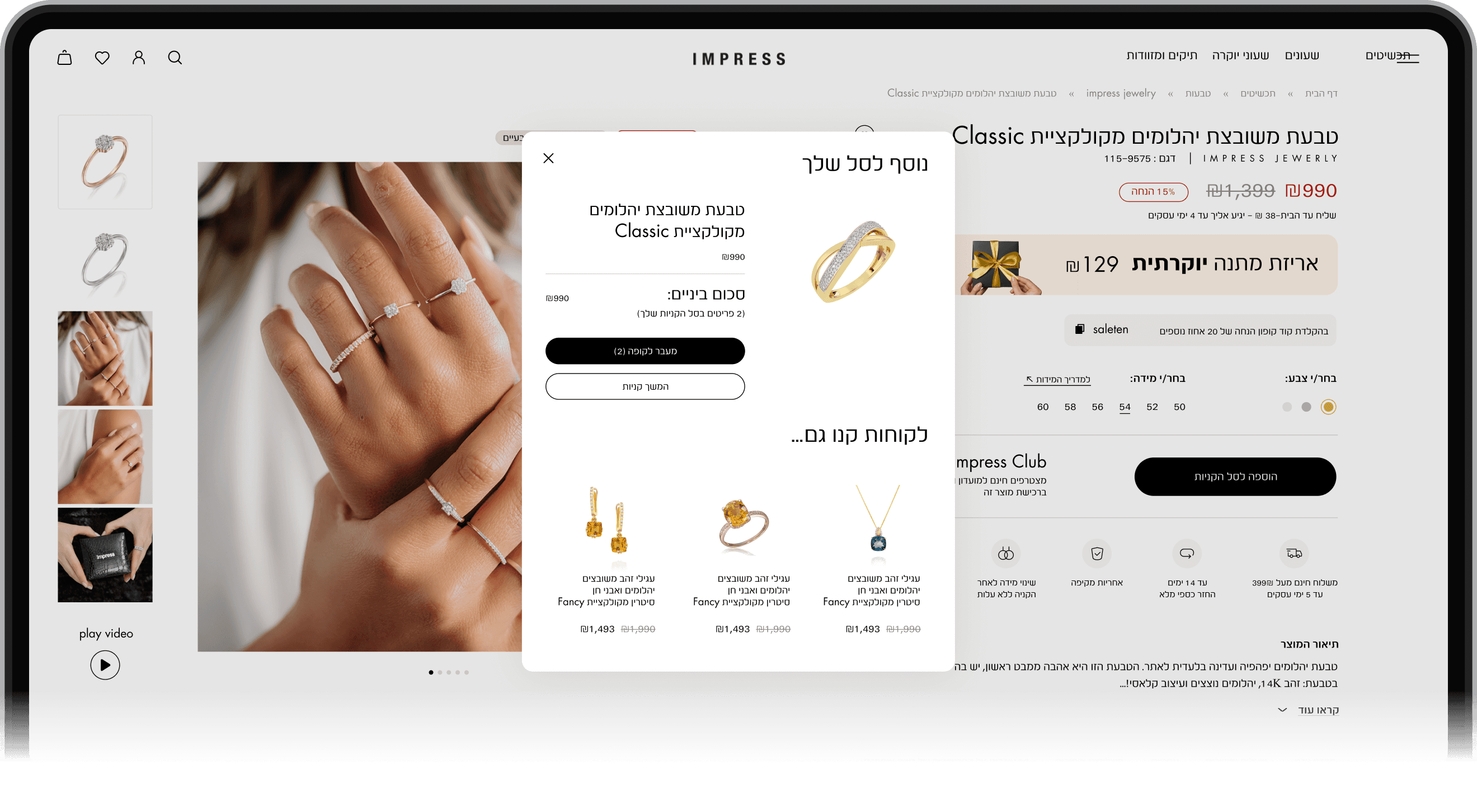
I was part of a 3-designer team tasked with redesigning Impress’s e-commerce website - aiming to elevate the visual identity and improve sales performance.
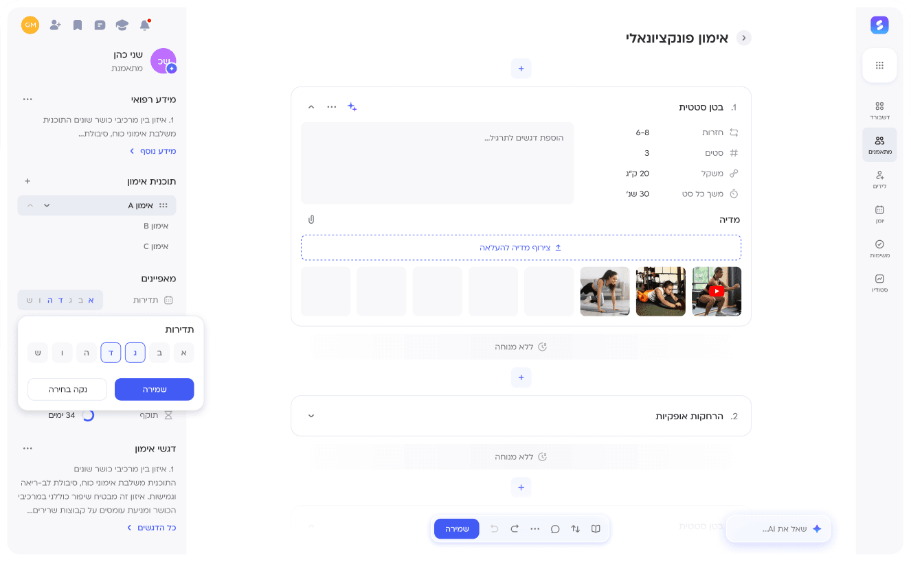
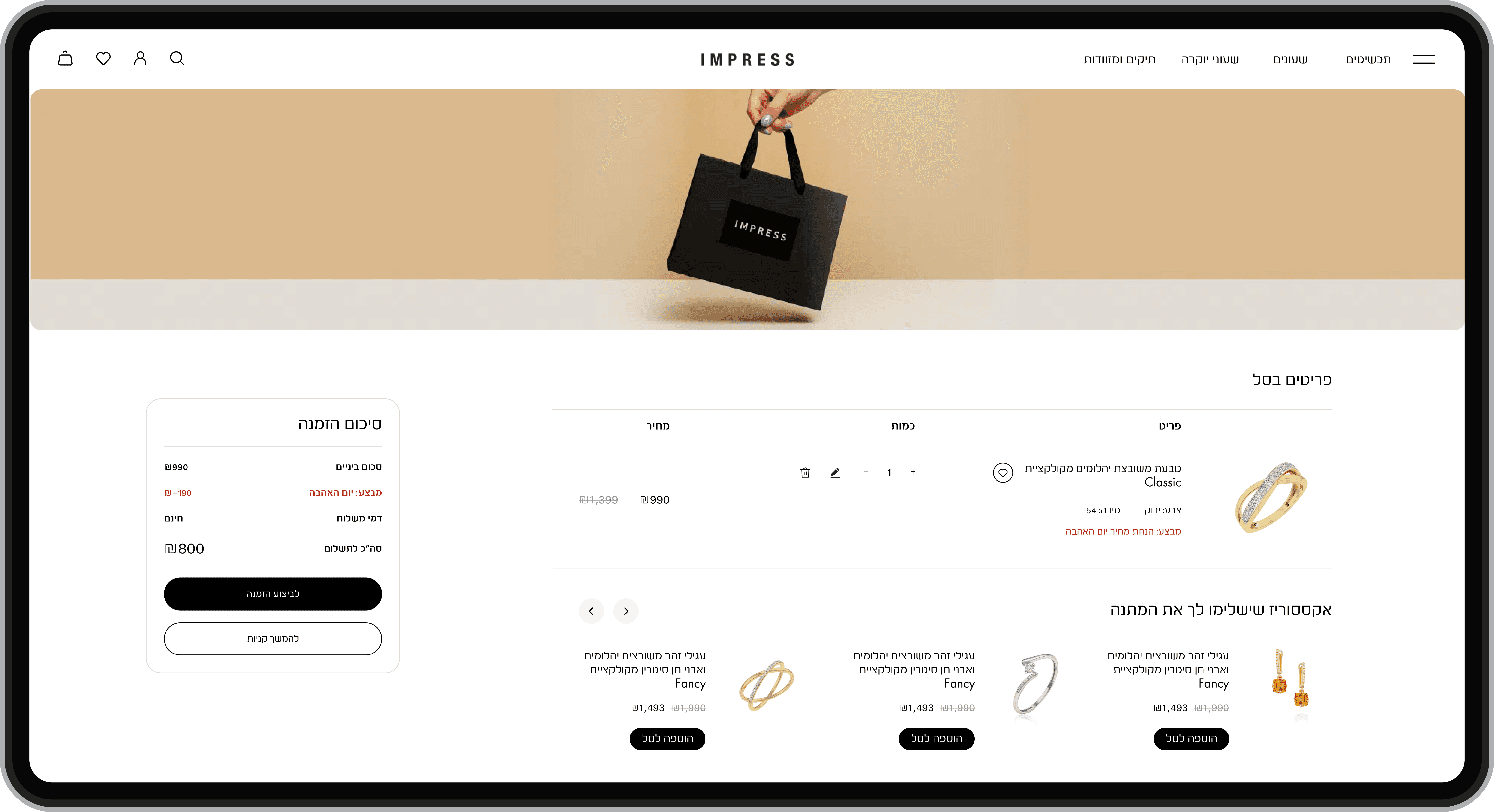
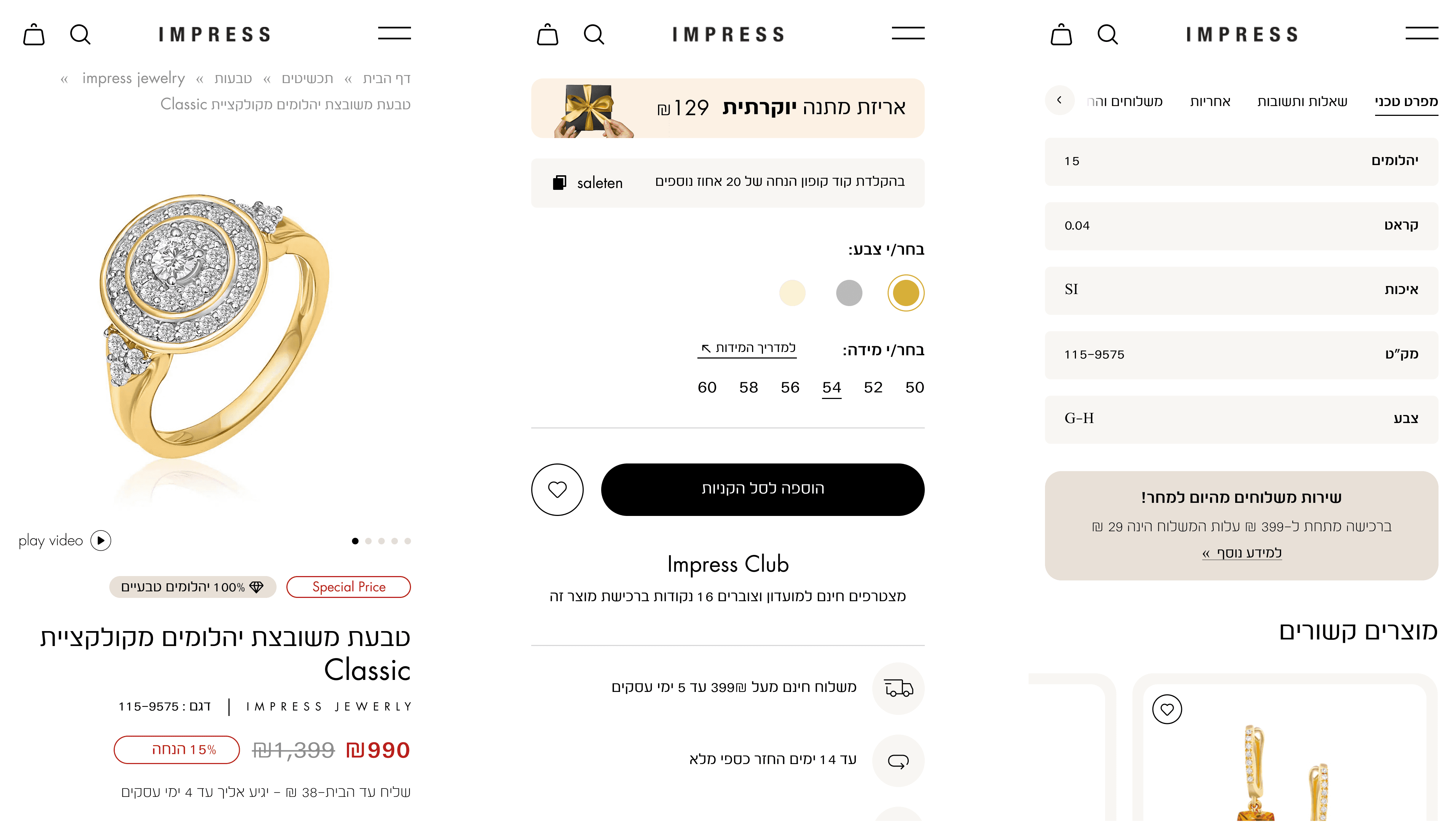
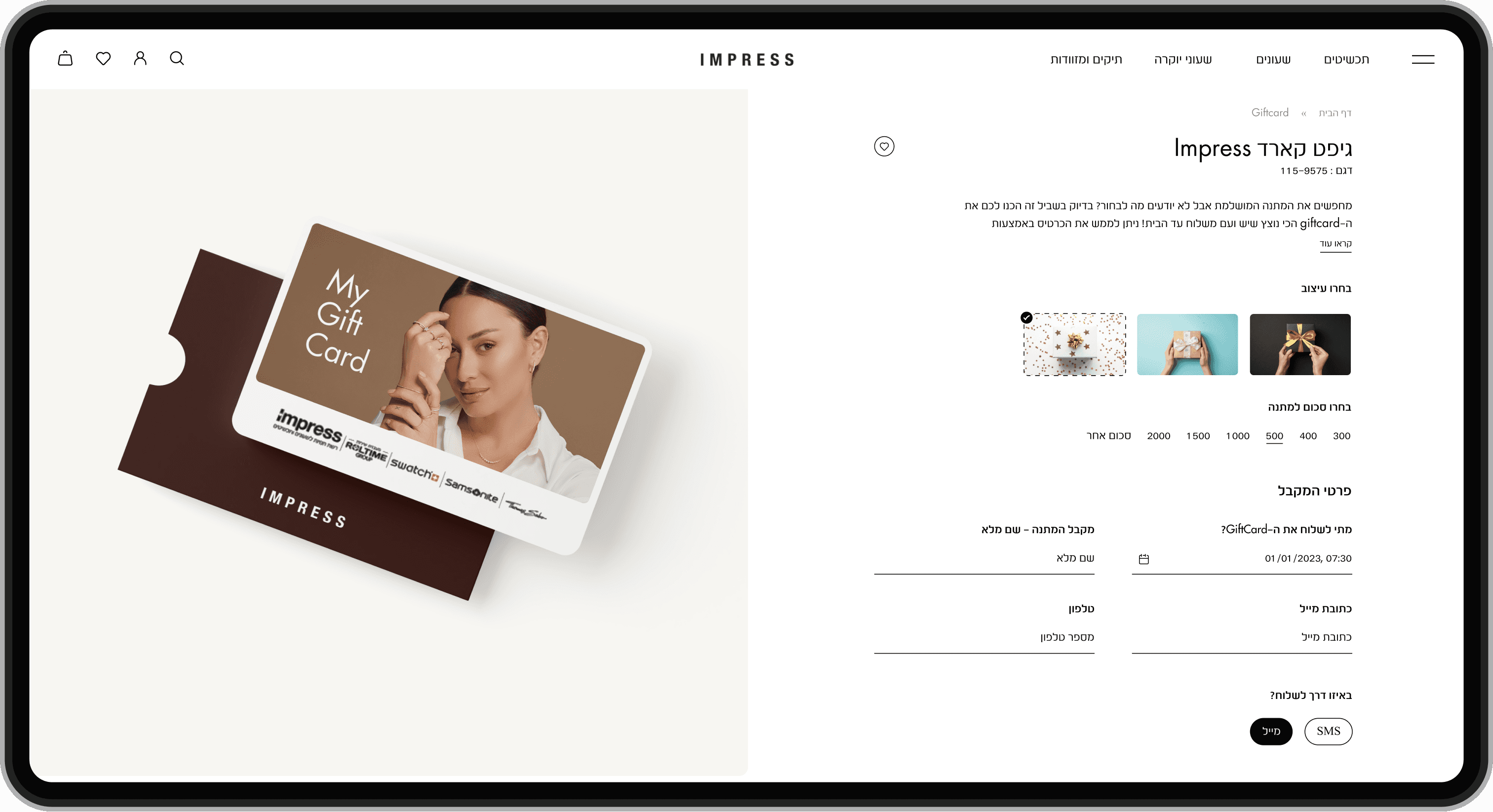
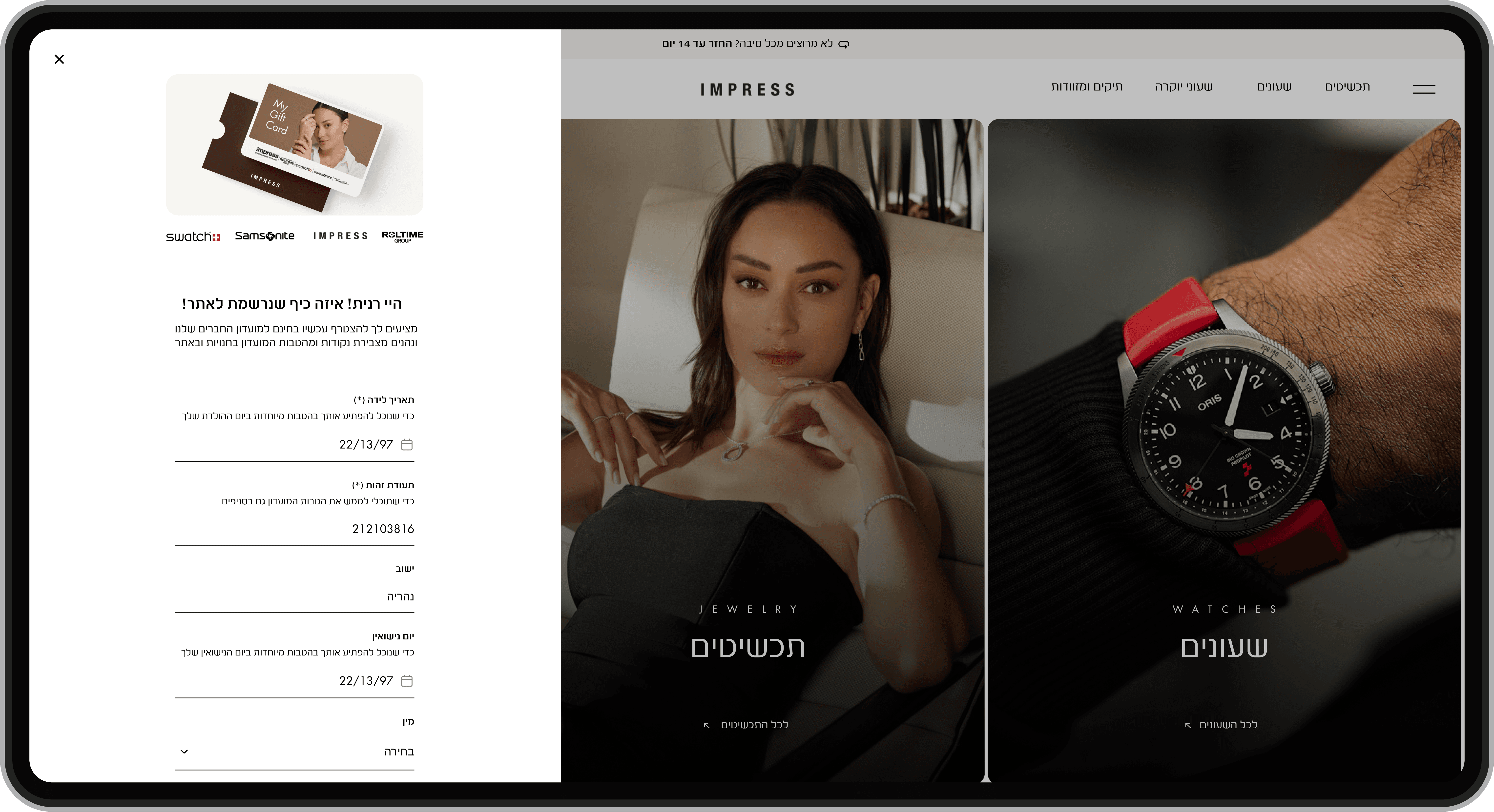
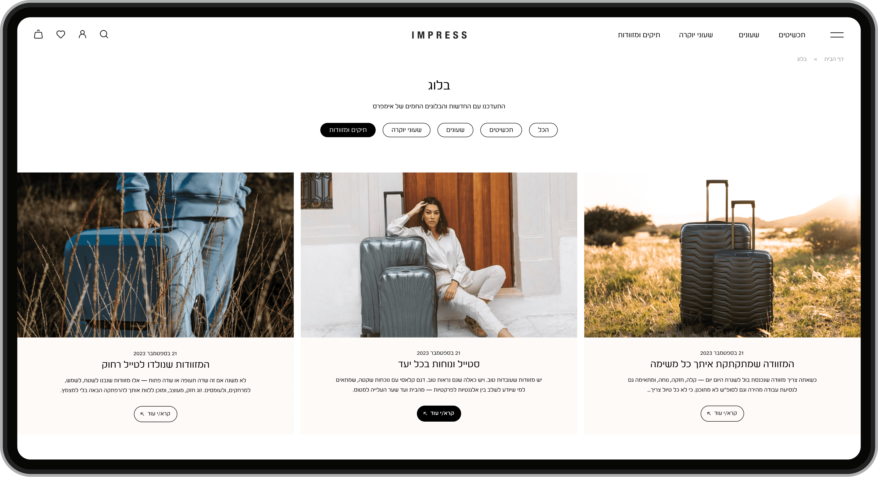
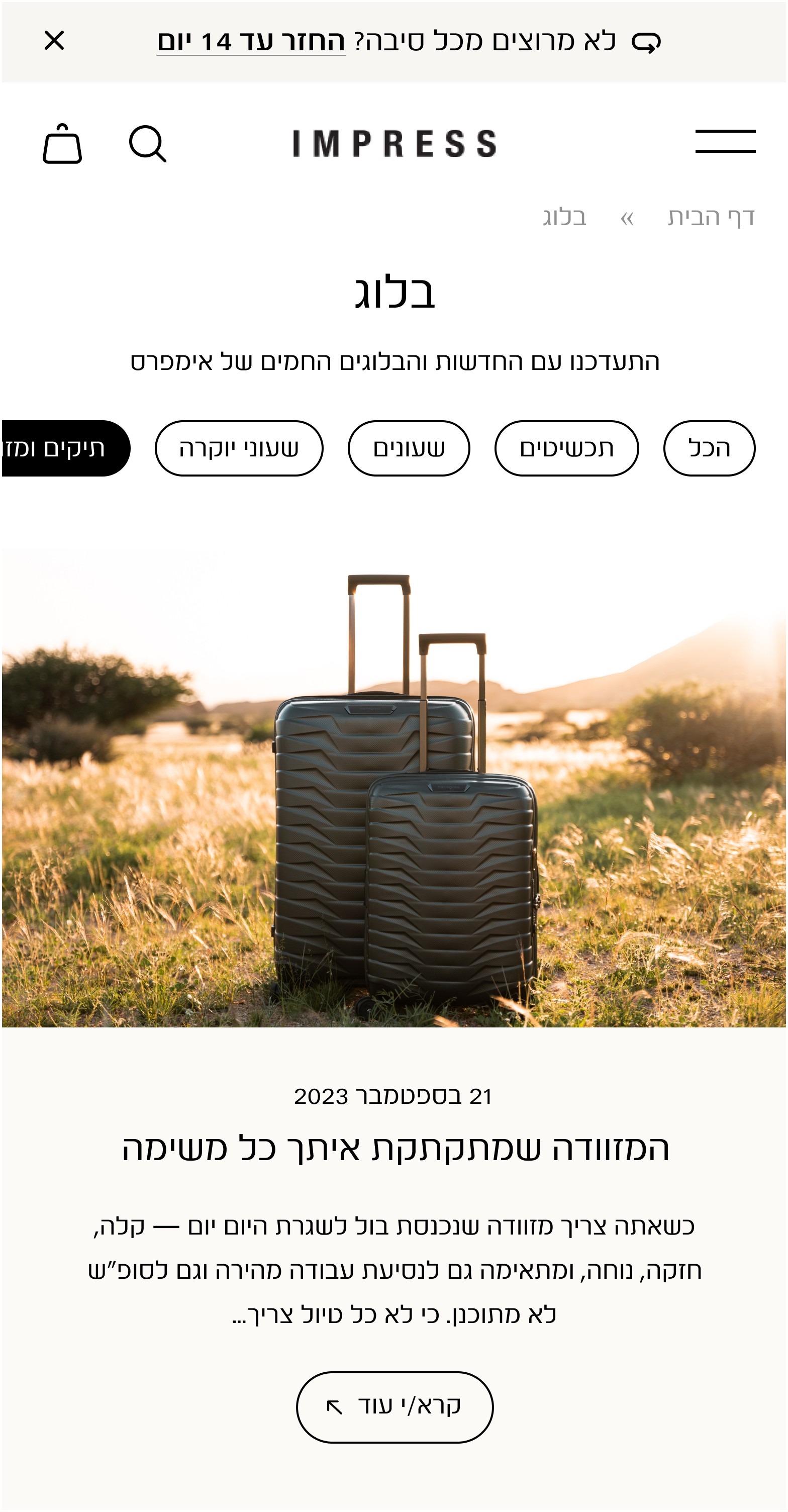
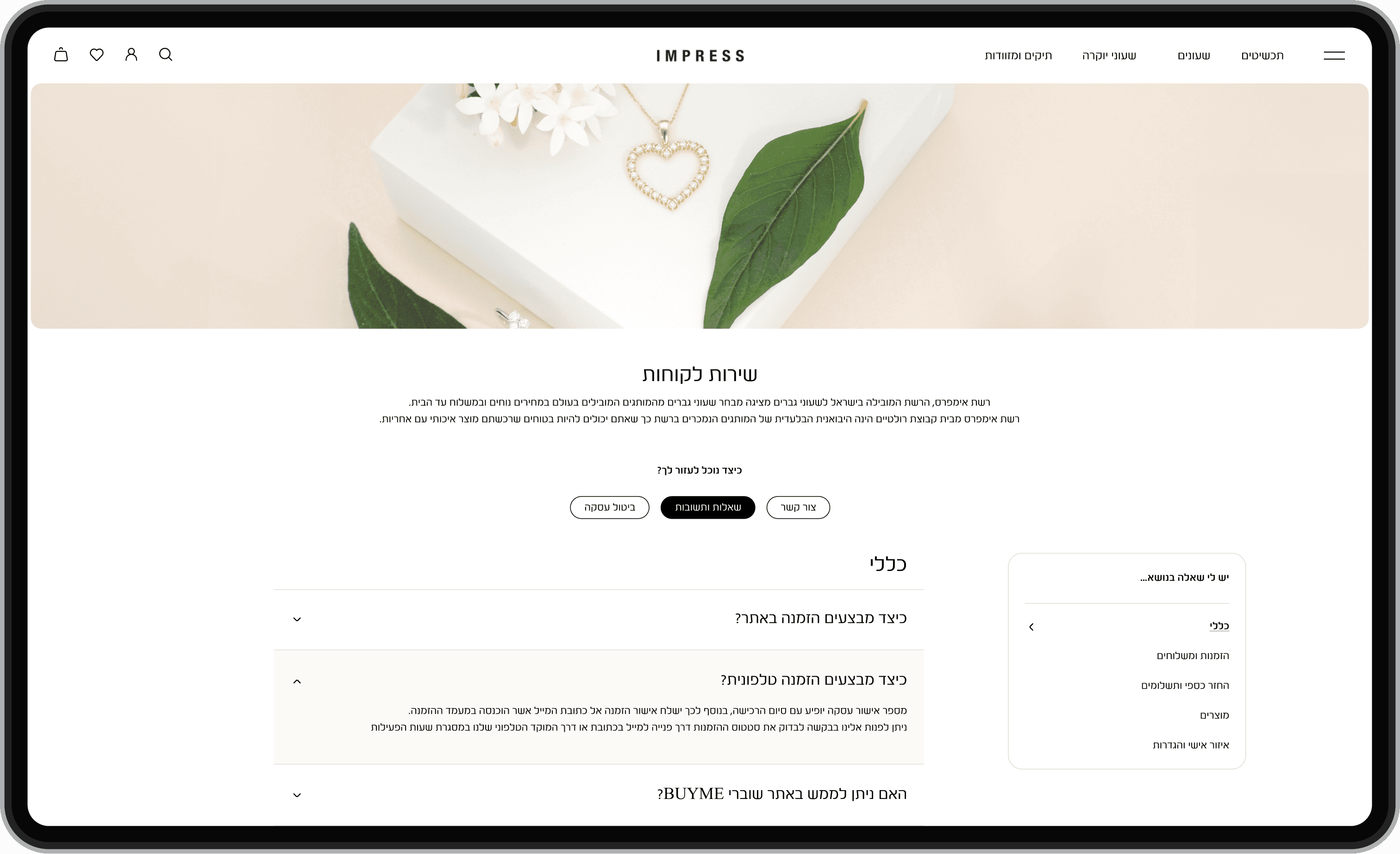
My focus was on the core user experience flows and functional pages: purchase flow, loyalty club, product page (mobile), Trade-In, personal area, blog, and various template-based layouts.
The other designers focused on the homepage, shop lobby, store page, and category pages.
Problem
The site needed a luxurious, polished look that reflects the brand and helps drive sales.
Outcome
Increased sales by 60% through improved UX focused on the purchase flow and Impress club experience.
ROLE
UX/UI DESIGN
AREA
Desktop, MOBILE
TIMELINE
jul '24 - sep '24
STATUS
SHIPPED (LINK)

The project kicked off with a clear brief: redesign Impress’s online store to match its luxurious brand and support its ambitious sales goals.
We started by identifying the core challenge: the existing website didn’t reflect the company’s upscale positioning or deliver a modern shopping experience.
From there, we moved into a research phase, analyzing top-tier e-commerce sites in the fashion and jewelry space to gather visual and UX benchmarks.
This helped us align on a design direction that felt clean, spacious, and premium.
Once the foundation was clear, we moved into ideation and iterations - refining the flow through internal reviews, close collaboration with stakeholders, and continuous feedback.
WHAT WE PROVIDED

Smart e-commerce touchpoints
Behavior-based elements like personalized suggestions and coupon prompts at checkout designed to align with user intent.

A premium brand experience
From typography to layout, every detail was designed to evoke elegance and trust - making the brand feel like a high-end, international name.

Effortless navigation and clarity
Simple flows, clear hierarchy, and thoughtful UX decisions ensure a seamless experience - whether users are exploring collections or completing a purchase.
We didn’t have a strict deadline, but we knew we wanted to move fast without compromising quality.
Over the course of one focused month, we designed all the key pages of the website.
The process included research, early design exploration, stakeholder feedback, and refining both desktop and mobile experiences in parallel.
Staying aligned with the brand vision while making quick, smart decisions helped us deliver a full e-commerce experience in just a few weeks.

EXPLORATION
We began with a focused inspiration phase: researching similar brands to understand the visual and UX standards expected from a high-end e-commerce experience.
This helped us align on the aesthetic direction, identify interface patterns, and set the execution bar for both user experience and visual presence.

Gucci’s design language guided us in creating a sense of luxury through large imagery, generous spacing, and refined typography.

We looked to D&G for bold, distinctive UI inspiration - especially in areas like the personal account section, which felt custom and unconventional.
Option 1: Side Panel
A collapsible cart sliding in from the left.

Key insights:
Familiar e-commerce interaction.
Leaves product context visible.
Feels more casual and less premium.
Option 2: Centered Pop-Up
A modal overlay that appears at the center.

Key insights:
Feels more focused and actionable.
Creates a stronger transition moment.
Encourages user commitment to buy.


This was one of the most impactful projects I’ve had the chance to contribute to - with major results and impact, wide user exposure, and valuable design lessons.
I took a leading role in key areas and helped shape a refined, high-performing digital experience that delivered real value.
01
60% boost in sales
A more polished look and smoother purchase flow led to a measurable increase in conversion and engagement.
02
Flexible and client-focused
The design system is scalable and perfectly tailored to the brand’s ongoing needs - easy to update, easy to grow.
03
Growth through collaboration
This project deepened my ability to design within a shared design language, keep flows simple, and work closely with other designers toward one cohesive result.
MORE WORK YOU MAY LIKE…