Strain is an all-in-one platform for fitness studios, coaches and trainees.
In this project, I designed one of its core features - a modular tool that enables coaches to build and manage personalized training programs.
I led the work from research through execution.

Strain is a platform built to support the full relationship between fitness coaches and their trainees - from scheduling and payments to progress tracking. I co-led the startup with a small team, shaping the product strategy and leading its design.
The platform was born from a clear pain point: most trainees struggle to follow structured programs, while most coaches juggle PDFs, spreadsheets, and chats. It’s messy, unscalable, and not built for coaching.
We set out to change that. The goal was to create a flexible experience that makes it easy for coaches to build workout programs.
My role was to design the core feature - from mapping real-world workflows to building a system that supports them end to end.
Problem
Most coaches rely on scattered tools, making it hard to build structured workout programs that trainees can follow.
Outcome
Responsive screens with a strong user experience, built on a scalable design system and fully prepared for development.
ROLE
Product design
AREA
Desktop, MOBILE
TIMELINE
May '25 - jun '25
STATUS
IN DEVELOPMENT

THE PROBLEM
Most coaches juggle spreadsheets, PDFs, and chats just to put together a program. There’s no real structure, no built-in logic, and no way to scale.
What’s worse is the emotional toll: coaches invest hours building programs, but the process feels clunky and thankless. Every change means starting over, personalization is hard to maintain, and managing multiple clients quickly becomes exhausting. It’s not a lack of skill, it’s a lack of the right tool.
KEY PURPOSES


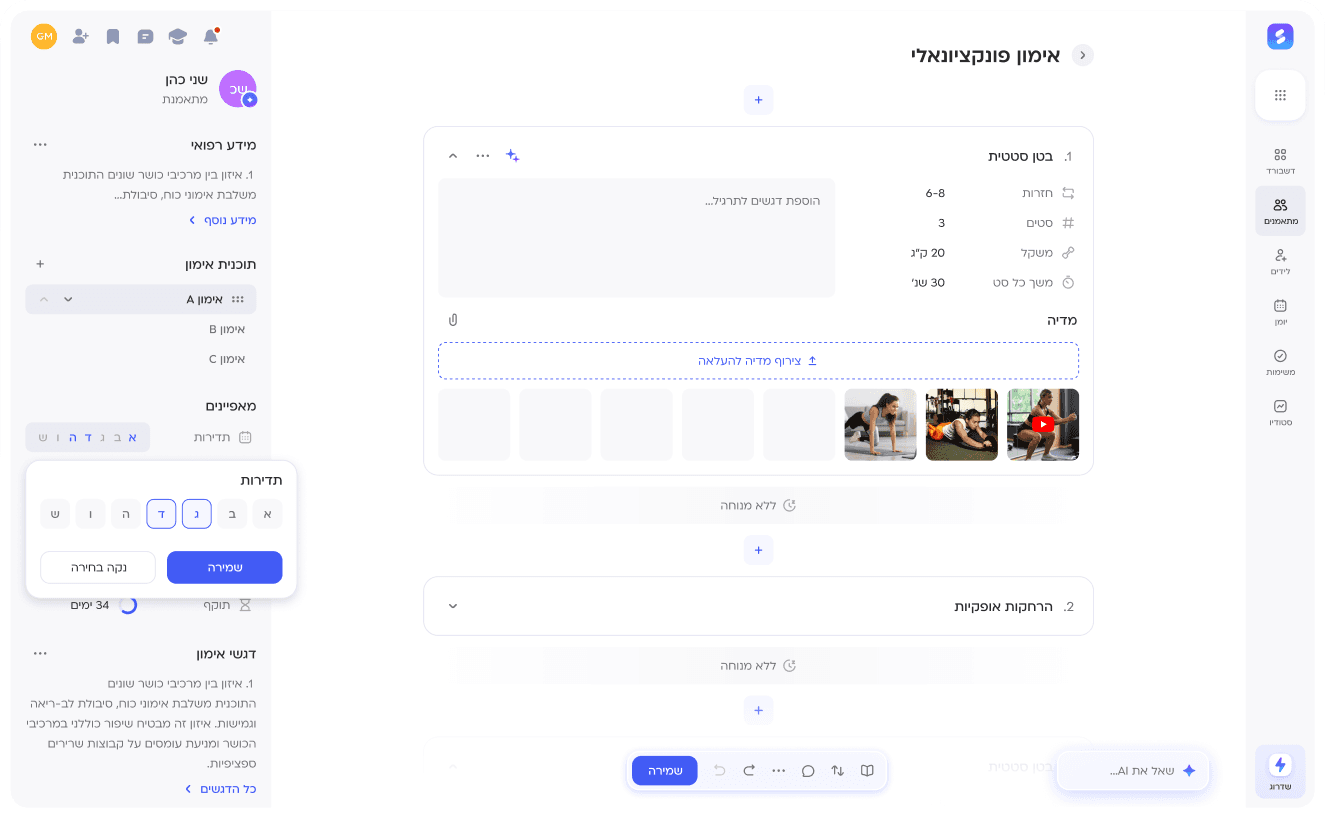
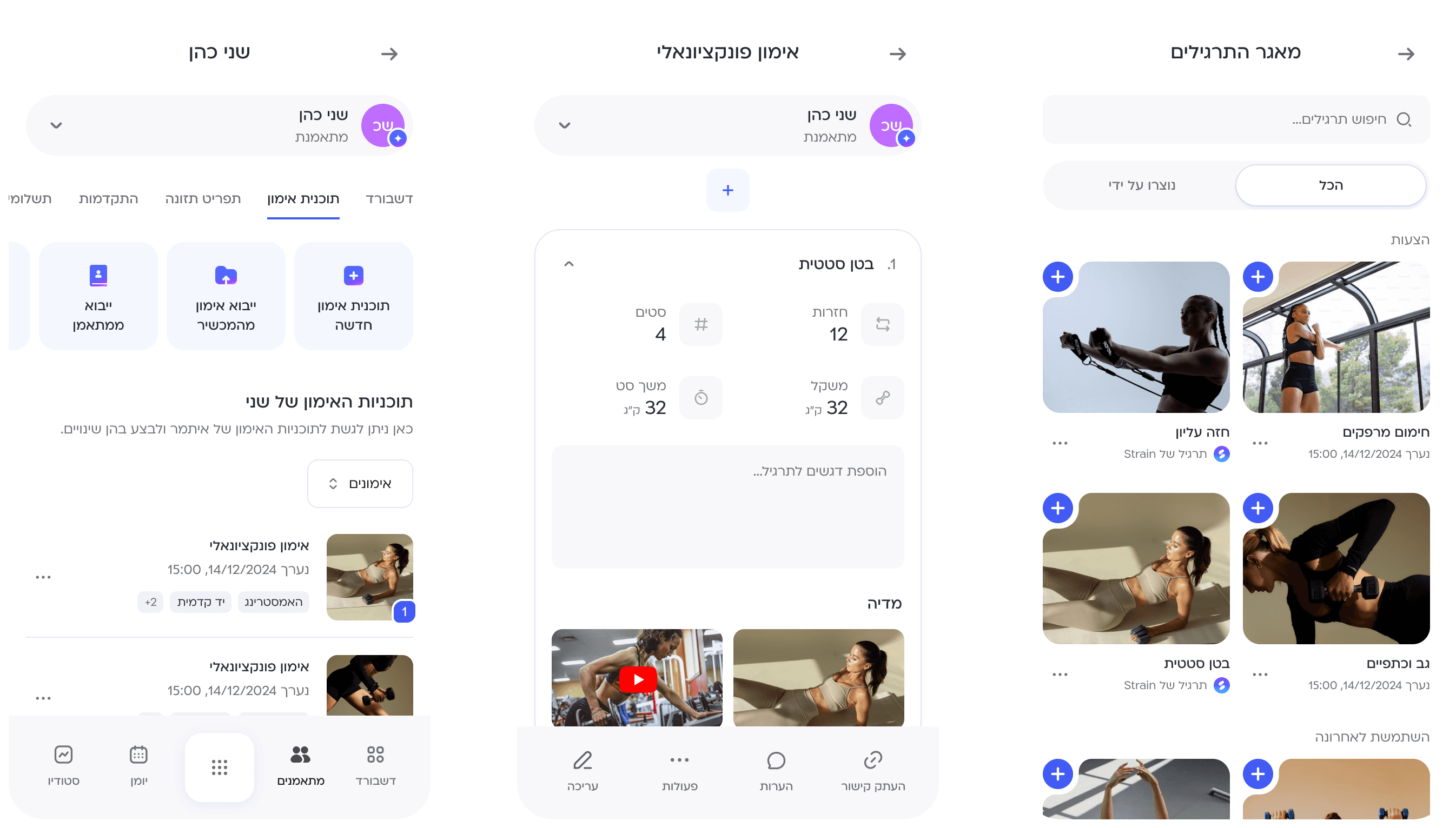
Frictionless program creation
Creating training programs using saved templates, imports, or from scratch - whatever fits best for each scenario.


Scalable and flexible editing
A modular system that gives coaches full control over structure and content, allowing programs to grow with each trainee’s progress and goals.


Guidance through AI and templates
Built-in templates and AI-driven suggestions assist coaches in shaping effective, personalized programs with greater speed and clarity.
I’m proud of this project because I took a vague, complex problem and turned it into a clear, well-designed solution. The goal wasn’t to build or test.
It was to define the core experience, design it from the ground up, and create a system that’s ready for development.

To uncover how coaches and trainees experience the current workout planning process, I conducted five one-on-one interviews. Three participants were coaches who manage multiple trainees. Two were clients receiving ongoing training.
The questions focused on how programs are built today, what feels frustrating, and what kind of support people are missing. Below are a few insights that stood out:

Quote from coach #1
“It takes so much energy to build a program in notes or a doc. There’s no structure, no system. Every time I do it, I feel like I’m patching things together from scratch. It doesn’t feel organized, and honestly, it doesn’t feel professional either. I know I’m not giving my clients the kind of experience I’d want to receive myself",
Quote from coach #2
“It feels like I spend more time managing spreadsheets than actually training people. I'm jumping between tabs, updating cells, and double-checking if I missed something. It’s frustrating because I became a coach to help people, not to fight with Excel all day. That’s not where my value is".
I started the research phase with a short survey, shared with 17 active fitness coaches. The goal was to get a quick snapshot of how they currently build and manage workout programs, and where things tend to break.
The responses helped surface some clear patterns, from manual tools and time-consuming updates, to frustration around tracking and lack of structure.

Lack of visual assets
Coaches lack a clear library of exercise media, making it harder to build visual programs.
Lack of a professional format
Coaches feel less credible sending messy docs, even when their knowledge is solid.
Every update feels like starting over
Instead of refining a system, coaches rebuild from scratch every time, even for returning clients.
Spreadsheets are the main tool
Excel or notes became coaches' main tool - not because they fit, but because nothing else does.
To sharpen the problem we’re solving, I mapped the user’s journey across key friction points - from their goal to what holds them back.

Personal trainer – problem statement:
A private coach wants to provide structured programs and track client progress, but ends up using Excel or Notes - not because they fit, but because there’s nothing better. These tools make it hard to update, organize, and reflect data in real-time, which leads to missed progress tracking, loss of professionalism, and frustration for both coach and client.
Studio coach – problem statement:
A coach working at a studio wants to follow up with multiple clients, maintain consistency, and deliver results, but struggles due to scattered tools and lack of centralization. Data is often stuck in paper logs, WhatsApp, or internal studio systems that aren’t built for dynamic program updates. This leads to inefficient communication, drop in client engagement, and reduced sense of ownership.
IDEATION
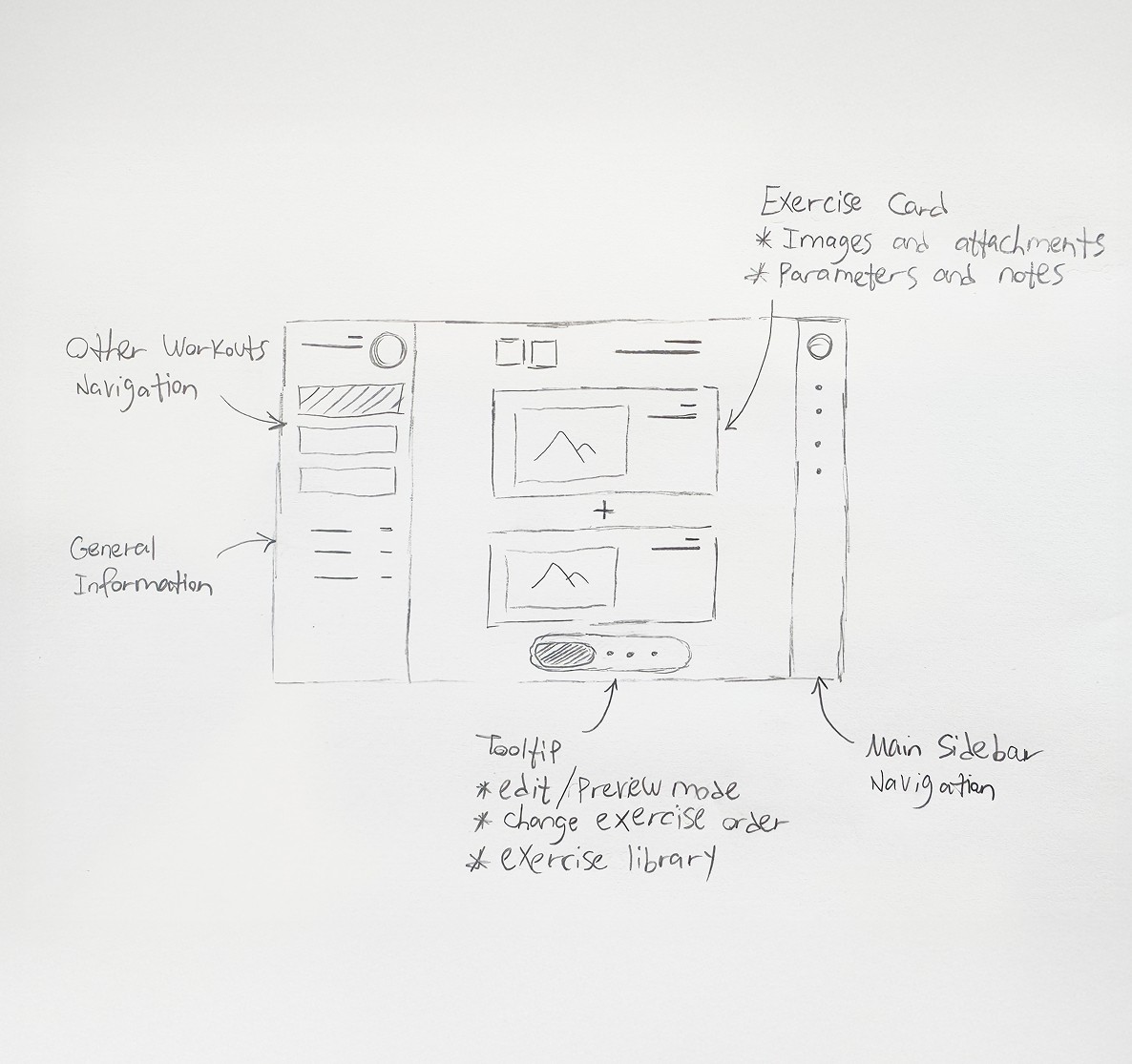
Exploring the main layout - I wanted everything visible, but not noisy.
Navigation, editing, and the library had to feel close, but out of the way.
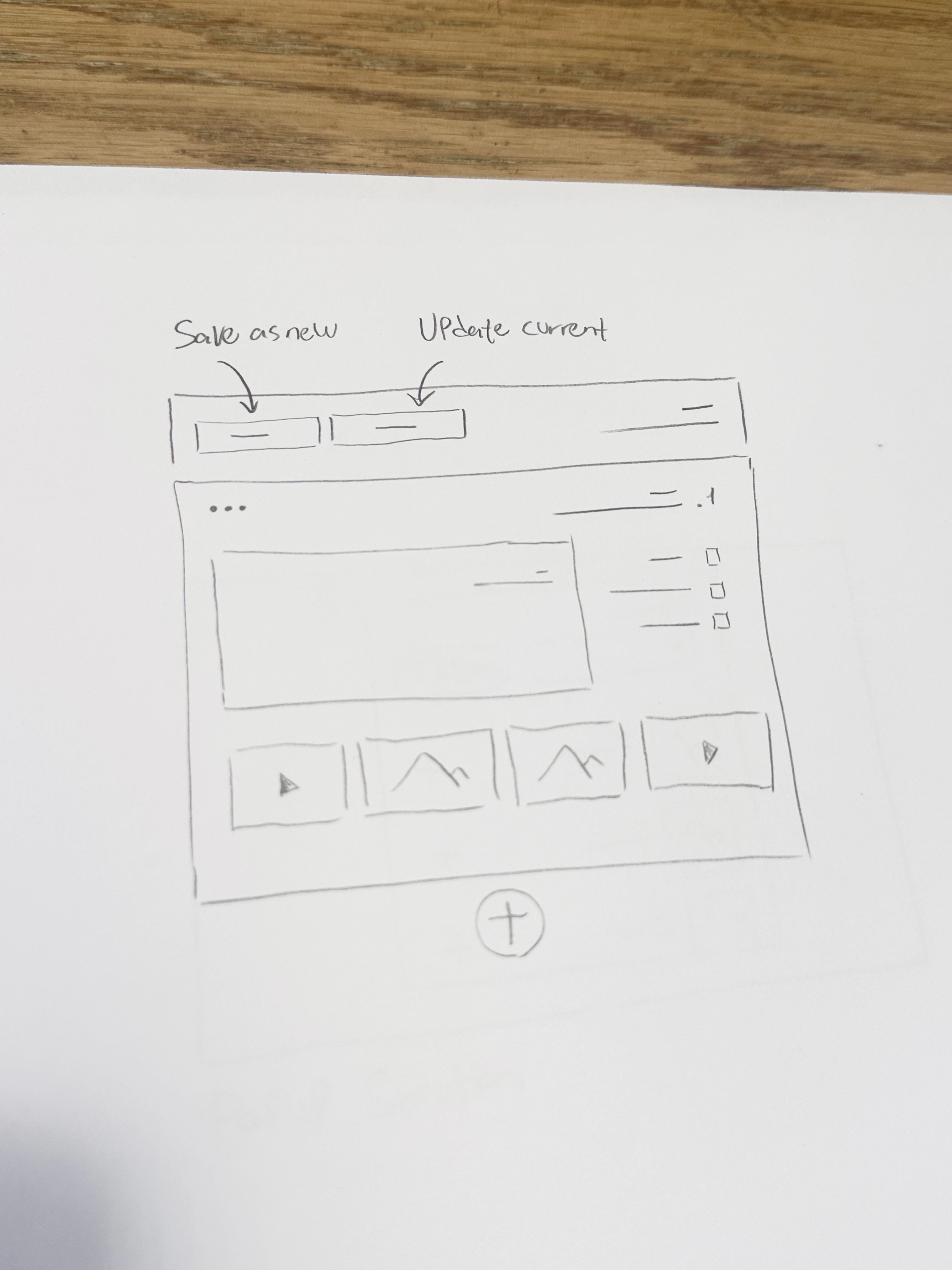
Thinking through update logic - how to let coaches save changes without friction, and surface the right suggestions at the right time.
Option 1: Sidebar View
A fixed sidebar integrated with the workout plan editor.

Key insights:
Quick access while editing the workout plan.
Limited screen real estate, not intuitive for mobile.
Too much visual noise when both views are open.
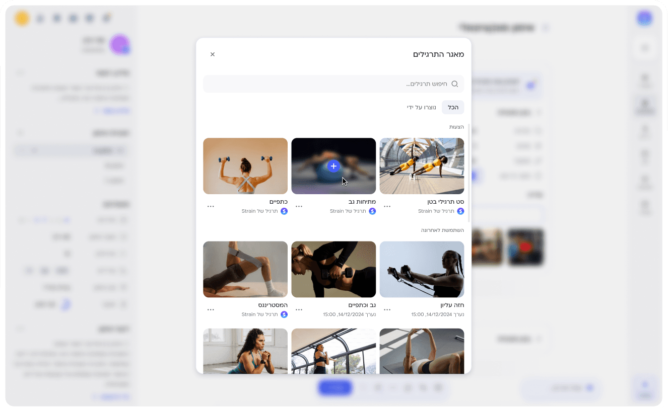
Option 2: Pop-up on click
A pop-up view triggered by clicking the library icon in the tooltip.

Key insights:
Cleaner layout with more space for exercises.
Easier to adapt to mobile experience.
Felt more intentional and focused for the user.

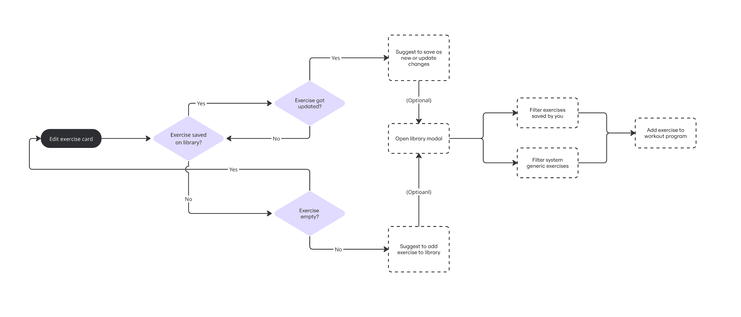
The exercise library was a key solution to a major user experience: saving time and effort by reusing the same exercises across different programs.
I had to develop a structured flow to suggest the right actions within the right user scenarios, focusing primarily on guiding and encouraging to save exercises to the library.


This project was all about laying a strong foundation, not just for the product, but for the design mindset behind it. I focused on giving coaches the clarity and tools they need to build great programs, knowing the system will continue to evolve.
01
Coach-first focus
I deliberately focused on the coach’s experience rather than the trainee’s - since we’re still building out the system step by step. That clarity helped shape a more purposeful flow.
02
Still waiting to test
I’m looking forward to running A/B tests and deeper usability validation once the product is developed. I already have clear hypotheses I’d love to explore.
03
Design is strategy
This wasn’t just about clean UI - every decision was made to support long-term product thinking: scalability, mental clarity, and a system users can grow with.
MORE WORK YOU MAY LIKE…